Health Inequalities in Boston by T-Stops: A Pictorial Essay.
 In a previous Dean’s Note, I commented on the role of cities in producing health, and I presented some data about health in Boston. I thought I would elaborate on that a bit today, but do so a bit differently: pictorially.
First, by way of setting, Massachusetts has about 315 doctors per 100,000 people, more than 10 percent higher than the next closest state (Maryland). Much of this is due to a remarkable density of physicians and trainees in Boston itself. The state also spends more on healthcare than any other state and has the lowest percentage of residents without health insurance (4.4 percent). All of this might suggest that Boston would be a tremendously healthy city, a paragon of urban health. And, in many ways, it is. We have some of the highest life expectancy of any US city (about 81 years). But, like many US cities, Boston also has some extraordinary differences, both in health indicators and in the drivers of those indicators within its borders. Health disparities, or health inequalities, have long been part of the public health conversation, appropriately so. I will write about health inequalities in a future Dean’s Note.
Today though, I present a different type of note, aiming to represent visually the geography of Boston health and its determinants. To do so, I thought I would consider the health of Boston through a simple device: the T. Suppose we are riding the T and stopping at various stops: What does health look like at these stops, and what do the drivers of health look like? To illustrate this question, I pick below a few representative T stops that can summarize what we see throughout the city.
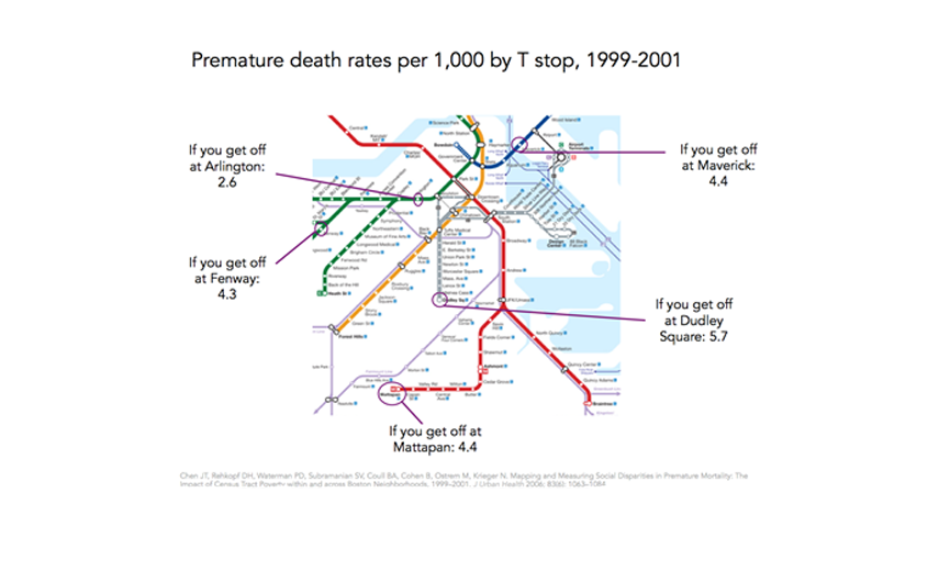
We can start with a core health indicator: premature death rates per 1,000. The T map below shows that premature death rate in the area around the Arlington stop, for example, is more than 50 percent lower than at Dudley Square station.
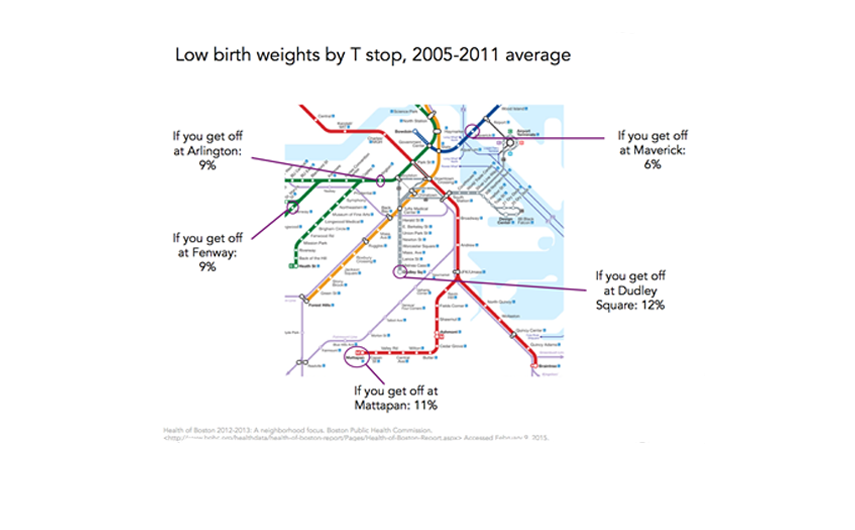
This is linked, in no small part, to health indicators like violence, with the map below showing how the homicide rate around the Dudley Square stop is eight times the rate around Arlington, and the rate at the Mattapan stop is almost six times the rate at Fenway.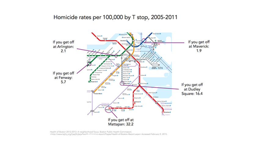 These differences extend well beyond health indicators among adults to other core indicators such as low birth weight, a marker for a substantial burden of poor health and disability later in life. In this case, the health differences are in the order of 25 percent when comparing Arlington and Fenway to Mattapan and Dudley.
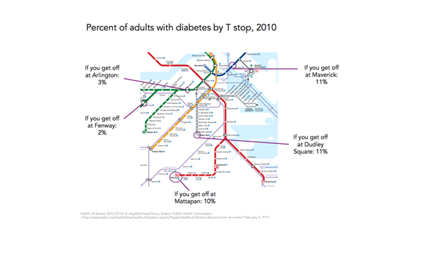
 It is then not surprising that there are similar differences, of similar magnitudes, for adult non-communicable disease indicators such as diabetes, as shown in the map below.
These health indicators are inexorably linked to a broad range of social indicators that are unevenly distributed across the city. Poverty is a frequently used summary indicator of socioeconomic position, well established as a marker of a broad range of other adversities. It is then not surprising, given the maps above, that poverty rates in some parts of Boston are four to eight times higher than those surrounding the healthier stops on the T.

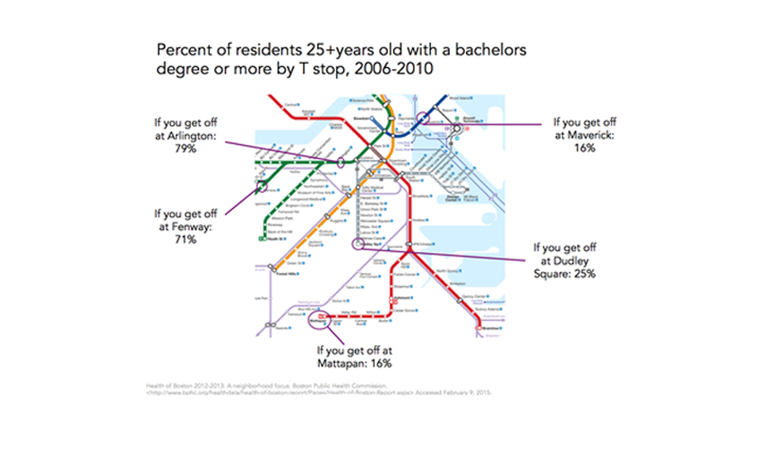
Other measures of socioeconomic position, such as education, track accordingly, with a graduate education being three or more times more common around the Arlington and Fenway stops than it is around Dudley Square, Mattapan or Maverick stations.
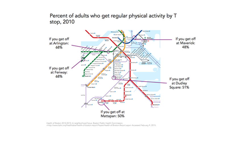
And, these differences are associated with commensurately poor health behaviors, such as physical activity that is substantially lower on the Red Line at Mattapan than it is on the Green Line at Fenway, for example. The question of whether socioeconomic differences in health is attributed in part, or at all, to differences in health behavior is, in and of itself, a difficult and complex question, and I would refer the reader to conflicting papers on the topic. I will comment about the contribution of lifestyle versus more foundational factors to the production of health in a future Dean’s Note.
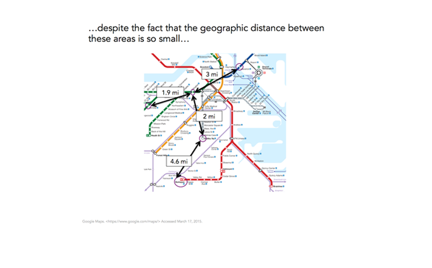
Inured as are to inequalities in health, we might well shrug off these health differences as ones between far-apart worlds. But are they? In fact, the geographic space we are talking about here is remarkably small. We are dealing with geographic differences of roughly four miles, or about an hour’s walk. In many respects, it is remarkable that areas so close to one another should have such dramatically different health indicators—“health worlds apart” that are simply down the street from one another.
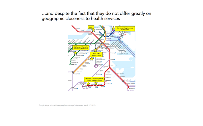
Rounding this out perhaps brings us back to the fundamental condition of Boston that we discussed earlier—the incredible density of physicians and hospitals throughout the city. It is therefore not surprising that none of the T stops we are discussing are particularly far from medical facilities. Clearly, medical centers differ in terms of populations served and variations in availability of care, but as the map below shows (and as can be verified through much more thorough analysis), there are negligible differences in physical distance of these neighborhoods to quality medical care.
This, then, tells a story of a city richly characterized by top-of-the-line medical resources and overall health indicators that are enviably good, but that has, within it, substantial heterogeneity in those same health indicators, associated in large part with variation in the fundamental socioeconomic circumstances that produce health in populations. The challenge to public health is apparent and vivid—how do we contribute to the generation of knowledge that can bridge these health gaps, and to the creation of conditions that produce health not just for some but for all, across a city like Boston?
I hope everyone has a terrific week. Until next week.
Warm regards,
Sandro
Sandro Galea, MD, DrPH
Dean and Professor, Boston University School of Public Health
@sandrogalea
Acknowledgement: I would like to acknowledge the help of Laura Sampson with the creation of the figures in this Dean’s Note, and that of Meaghan Agnew and Michael Saunders for critical reading and suggestions on content.
Previous Dean’s Notes are archived at: /sph/category/news/deans-notes/